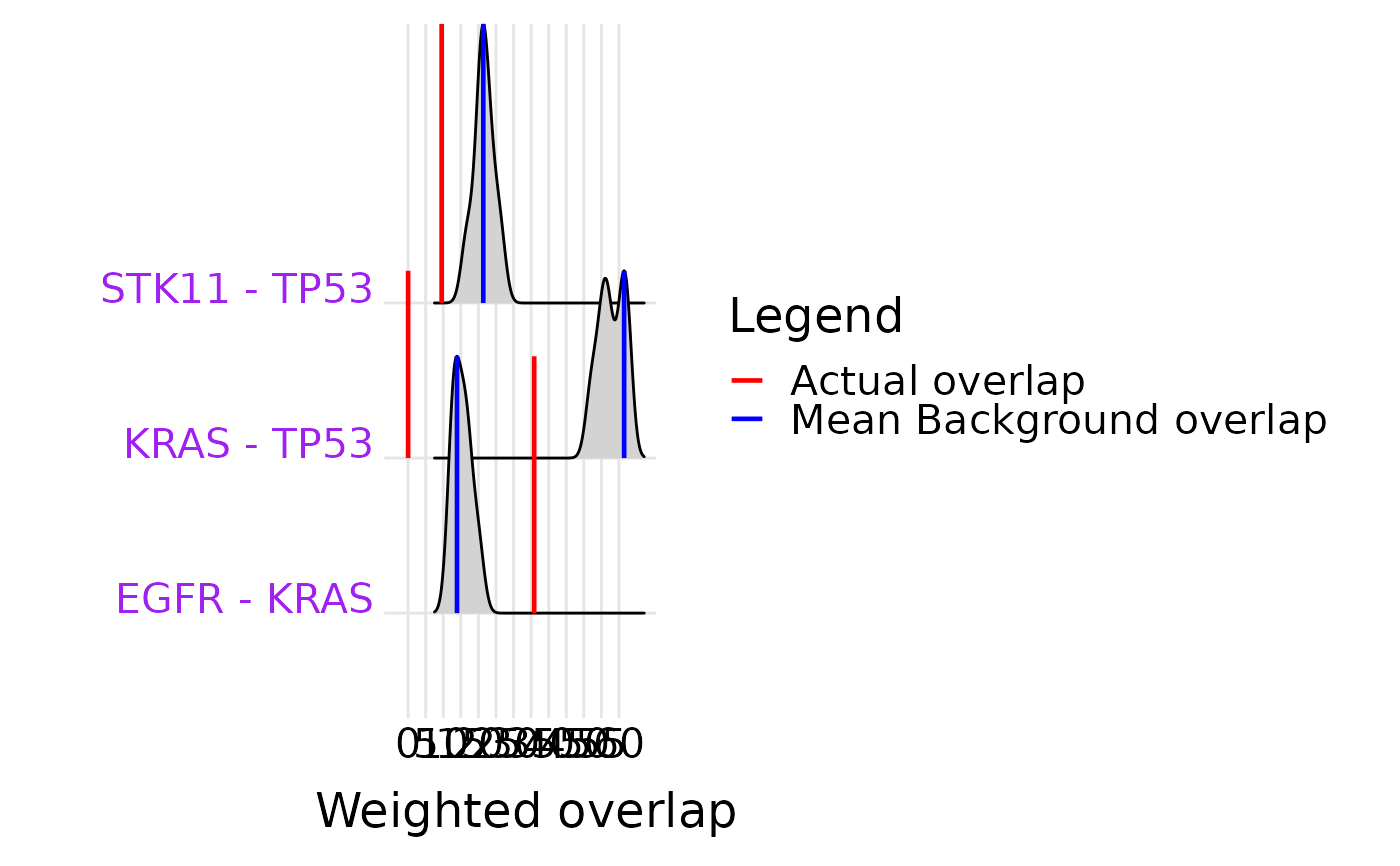
Ridge plot of null-model background distribution for significant gene pairs
Source:R/selectX_plot.R
ridge_plot_ed.RdFor each significant evolutionary dependency in result_df, plots the
null-model weighted-overlap distribution as a ridge, with vertical lines
marking the observed overlap (red) and mean background (blue).
Examples
# \donttest{
data(luad_run_data, package = "SelectSim")
result <- selectX(M = luad_run_data$M,
                  sample.class = luad_run_data$sample.class,
                  alteration.class = luad_run_data$alteration.class,
                  n.cores = 1, min.freq = 10, n.permut = 10,
                  verbose = FALSE)
sig_pairs <- head(result$result[result$result$FDR, ], 3)
if (nrow(sig_pairs) > 0) ridge_plot_ed(sig_pairs, result$obj)
#> Picking joint bandwidth of 1.68
#> Warning: Vectorized input to `element_text()` is not officially supported.
#> ℹ Results may be unexpected or may change in future versions of ggplot2.
#> Picking joint bandwidth of 1.68

# }
# }